Why Design this in Figma?
As a Product Manager, my role is to set the product strategy and rally together a cross-functional team to bring this vision to life. In reality, Product Managers and UI designers have similar goals as they both aim to improve the customer experience through digital products. Therefore, Product Managers need to understand principles of great design in order to:
Provide feedback and direction to designers that is valid and aligned with customer needs
Understand how design affects the customer experience, and what a tradeoff in engineering/UI will mean for the overall product
Bridge the gap between teams to work cross-functionally
I wanted to improve my Figma and UX design process skills by taking on more of a product designer role and developing the end-to-end design process for a mental health app. Since the user experience for a mental health app is incredibly important to facilitate improvements to the user’s outcomes I wanted to dive into this topic as it also personally resonates with me.
You can find the Figma designs here in which have already been used by over 400+ people in the Figma community!
Why a Mental Health App?
As someone who has seen first-hand the impact mental health can take on your physical, emotional and overall wellness I wanted to create something that empowered individuals to take a data-oriented view towards improving their mental health.
Approximately 1 in 5 Canadians aged 12+ have symptoms consistent with mental health disorders and reported needing help with their mental health . 43% of those people with mental health disorder symptoms reported to having completely unmet or partially unmet needs. The most common barriers to meeting these needs are related to costs and not knowing where to reach out for help.
As mental health services (especially counselling) is extremely costly for most Canadians I wanted to use my knowledge of mental health to create a more accessible app. Specifically one that would focus on CBT (Cognitive Based Therapy) techniques to not replace 1:1 counselling, but provide a data-oriented view of support to help manage mental health symptoms.
Process & Quick Links
Phase 3: Develop (with user flows)
Phase 4: Deliver (with figma designs)
The Design Process
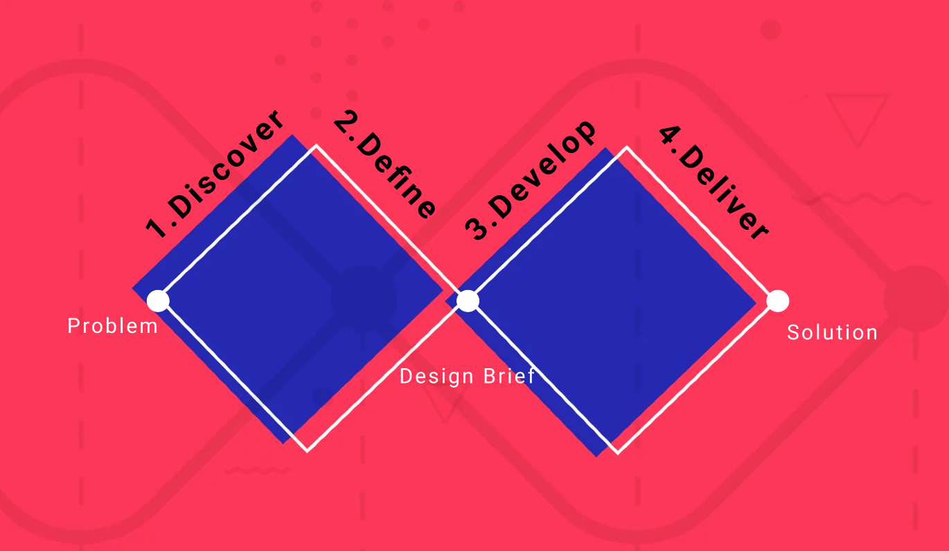
The Double-Diamond is a popular design framework to help designers and understand and appropriately respond to the user’s needs. While the framework has multiple variations as well as some limitations, it provides a powerful and simple framework for approaching ambiguous design problems. Since the problem/solution space I’m dealing with is so ambiguous, I was aiming for it to provide some structure to the design-thinking process.
Specifically, the Double-Diamond consists of Four Phases: Discover, Define, Develop and Deliver. The phases alternate between being divergent (determining as much information as possible) and convergent (condensing and refining) phases.
Phase 1:
Discover
The first Double-Diamond phase is Discover. This is a divergent phase, where we try to gather as much information as possible and embrace the complexity of the problem. There’s a wide array of methods to do this, but I wanted to focus on the three most commonly used; Current Landscape Analysis, Secondary Research and Primary Research.
Current Landscape Analysis:
I looked at current mental health offerings and summarized them into 7 main categories with the following value propositions:
Meditation (e.g Calm)
Research Based/Mental Health Professionals
Chat specific
Gratitude/Journaling
Activity/game based (e.g. do x if you’re feeling anxious)
Registered Therapist connection (e.g. Talkspace, BetterHelp)
Niche area (e.g. BIPOC specific, PTSD specific, sleep specific)
While all of these areas represent valuable areas, in order to facilitate a customer experience and design that has impact – my design needs to focus on one area and target specific pain points that people face that aren’t currently being addressed.
Primary Research
I surveyed 10+ individuals to identify the most common pain points for mental health app users. While 10 people is by no means a significant amount, I wanted to prioritize getting feedback from people who suffer from mental health issues and focus on a small user set at first. I also interviewed 2 mental health professionals to understand their viewpoint and further understand CBT practices.
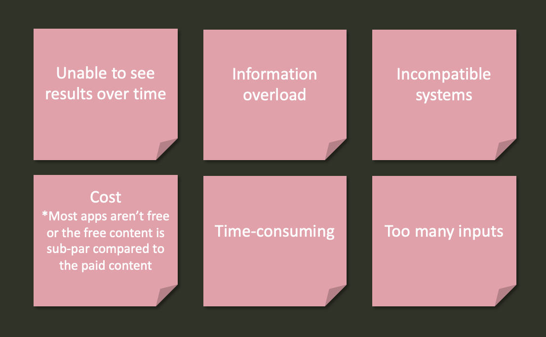
Summary of most common pain points for users/mental health practitioners using mental health apps
Secondary Research
Based on my secondary research, I wanted the app to focus on CBT (Cognitive Behavioural Therapy). Not only are these techniques well researched in terms of effectiveness – they are also simple enough for users to initially understand and importantly, begin incorporating.
Since CBT spans a large spectrum of types and techniques based on the facilitator, I looked at the most common types of CBT activities:
Negative thought patterns restructuring: Documenting every time an unhelpful thinking style occurs, what triggered it and challenging the thought with a contradicting positive thought
e.g. catastrophising is the negative thought pattern “I feel sad this morning, what if I always stay sad and depressed?"
This was triggered by feeling sad this morning, a contradicting challenging thought would be “I didn’t sleep well last night so it’s understandable that I don’t feel good today. It doesn’t mean the rest of my day is ruined.”
Journaling: Keeping an unstructured written account of your day, thoughts, feelings and allowing for reflection
Activity scheduling: To combat feelings of anxiety or depression, scheduling your day to include manageable “chunks” of activities to actively motivate you
Mood and Anxiety tracker: Tracking of mood, anxiety and energy levels at certain intervals to understand the relationship between mood, thoughts and anxiety/energy levels.
Exercises: Breathing, meditative or physical exercises to slow down your nervous system
Exposure Therapy: Gradually being exposed to a feared situation or object, learning to become less sensitive to it over time
Functional assessment (ABCs): Determine triggering behaviour and determining what happened before, during and after to understand why the behaviour is taking place
Antecedents (A) - Record events or interactions that happen directly before the behaviour occurs
Behaviours (B) - Observable behaviour
Consequences (C) - What occurs directly after the behaviour including verbal and physical interactions
Phase 2: Define
The second phase of the Double-Diamond Process involves a convergent Define phase. The emphasis is on refining all of the information from the previous phase into insights and ultimately a problem statement that the UX design will solve.
Using the CBT areas as a starting point, I then looked at how the most common pain points of mental health apps mapped against these. I also included other criteria such as my personal knowledge in this area.
From this, I decided to focus on a Mood and Anxiety tracker. In terms of the competitive space, people have been using manual approaches (e.g. physical journal or notes app/google docs) to track these values. And while some apps do include trackers for mood, energy and anxiety, none include all three of these inputs along with customizable check-in times and summaries over time to draw inferences. In addition the apps currently on the market aren’t specifically marketed as CBT focused apps. With this knowledge, I then talked to another mental health professional who confirmed that the three basic areas for tracking that individuals would benefit the most from would be: Mood, Anxiety and Energy levels.
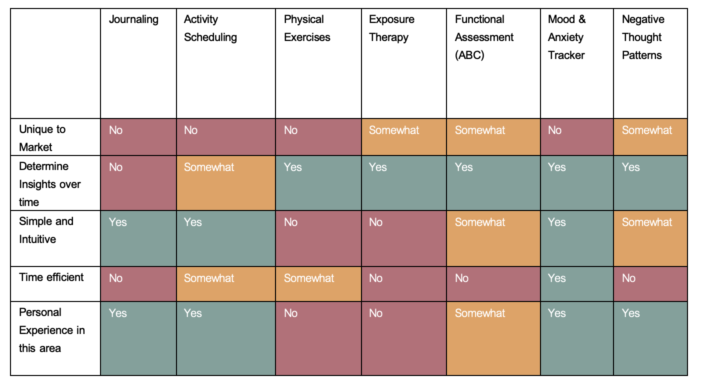
CBT Focus areas (x-axis) with Largest Contributing factors from Pain Points (y-axis)
Phase 3: Develop
This is the third phase of the Double-Design process, and once again is a divergent phase. Now that I’ve defined the parameters of the problem I’m trying to solve, I want to expand into possible solutions with the Develop Phase.
While CBT trackers involve a spectrum of potential areas, I wanted to focus on the most basic inputs. These are mood, anxiety and energy levels. Not only did I want to make it as simple as a few clicks, I also didn’t want to make the experience cumbersome or overwhelming for the user. I then brainstormed potential app features and worked to prioritize them.
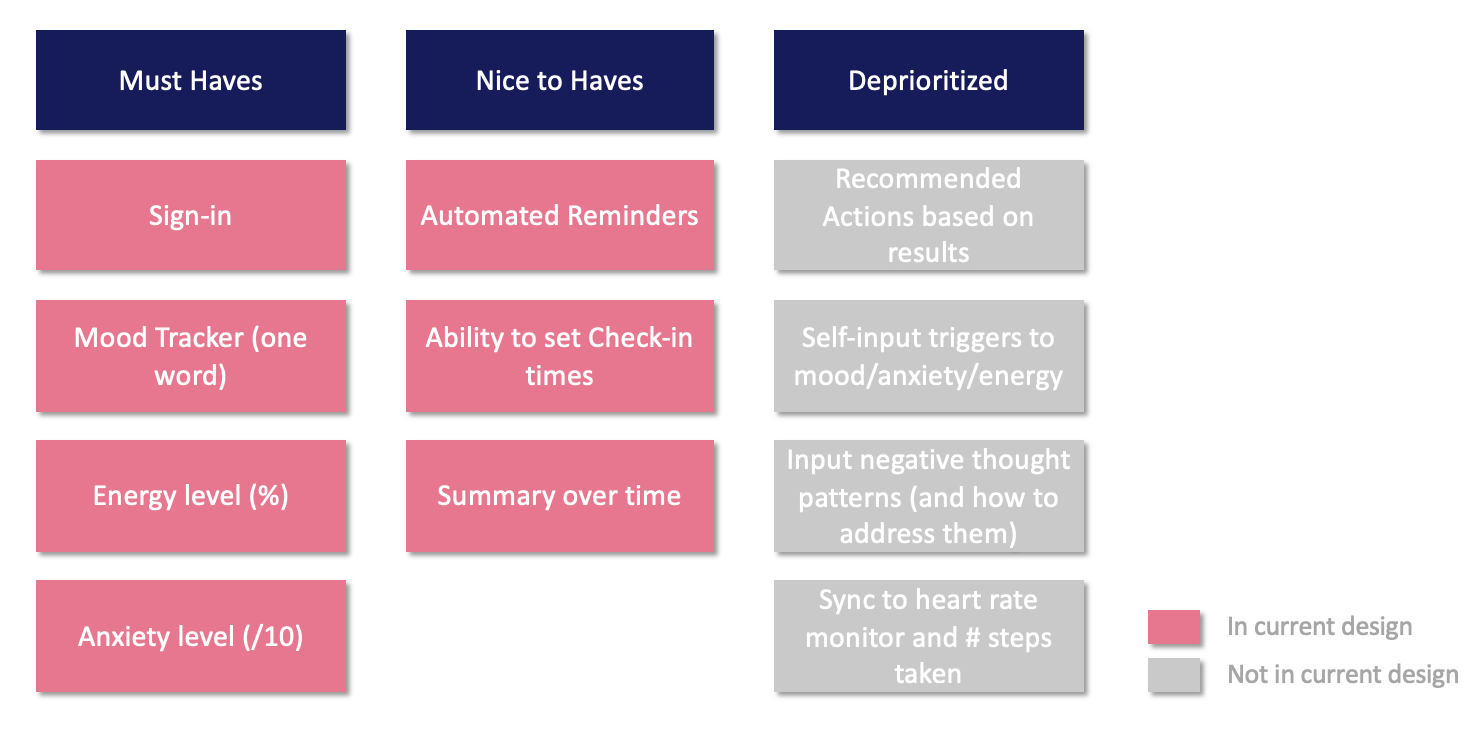
Features list with items in current design and not included in design (deprioritized)
The prioritized features are what I consider “Must Haves” or deal-breakers for this app. The sign-in page is also critical to privacy and security and the main function of the app is for the user to input their most basic CBT inputs (anxiety, energy and mood).
The features that I determined “nice-to-haves” and ultimately kept were Summary over time, Ability to change the check-in times and Automated reminders.. While these aren’t necessarily “deal-breakers”, and alternative manual workarounds could be put in place, the user experience would be significantly improved by having them. The summary over time was a key value proposition missing from the mental health app landscape and is a pivotal part of this app. The ability to customize the check-in times gives the user more control over the app and is much more likely to use it if it works for their lifestyle and schedule. In addition, the ability to have automated reminders on when those check-in times are is also valuable while relatively easy to configure and design.
I deprioritized the other features due to feasibility and impact. As this is the initial app, I deprioritized any integrations with phone data (e.g. syncing to heart rate monitor or number of steps taken) as not only would that increase the technical configuration significantly, it also would involve a lot more privacy and security protocols that would need to be in place. I also deprioritized negative thought pattern development as it relies on significant inputs by the user (every time they have a thought relating to a negative thought pattern and what happened, the result, alternative thought). Similarly, the self-input triggers also veered towards too many inputs for the user. These features I consider to be“not-now” features, as in not needed for this design but could potentially be prioritized in the future.
I then turned these features into a potential user flow

Phase 4: Deliver
This is where the design aspects came into full swing! In the fourth and final Double Design process my focus was on delivery in this convergent phase. I had made some initial paper wireframes as well as an ideal user flow. I then created higher fidelity wireframes in Figma.
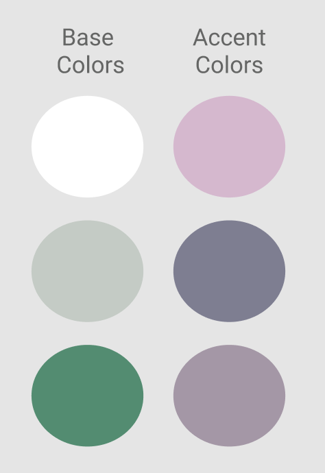
For the color Palette I wanted to focus on muted soft colors to bring a sense of calmness to using the app. In order to maintain a sleek, simple design I made the primary background color white and included significant white space. I kept the logo a simple line art design and all related imagery relatively free-form with the use of organic shapes instead of harsh, defined lines.
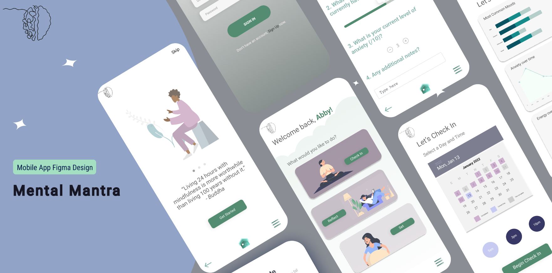
Now let’s dive into the specific screens. An interactive prototype of all these screens in high resolution can be of found here on Figma.

Log-In Screens
The launch screen is a simple background with the logo and the app name “Mental Mantra”. The sign-on page then displays a form for the user to input their username and password or alternatively, Sign Up for an account.

App Overview
Upon logging in for the first time (or signing up) the user is shown the App Overview pages. This shows how a quick summary of how the app works and are accompanied by imagery including screenshots of the input pages as well as the calendar. This provides an initial view into the design of the main components of the app. It also has valuable information about how the user will interact with the app and what they can get out of it.
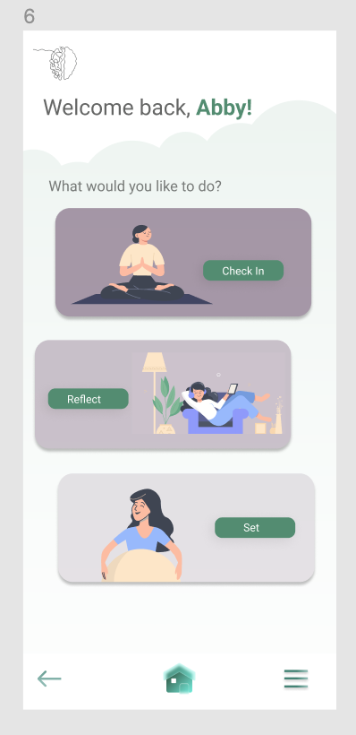
Home Menu
The user is now at the Home Menu. The user is given three choices:
1) Check-In. The user inputs their anxiety, energy and mood
2) Reflect. The user looks at their inputs over time to recognize patterns
3) Set. Settings page that contains information about data usage, customize check-in times and their account

Check-In
The check-in pages is where the user selects what date/time to check-in as well as inputting their check-in data. They initially see a calendar view of all their inputs for the month, categorized by the days that are complete, incomplete or the current day. They are able to make changes to check-in up to 24 hours after the day is over (they are able to do this as sometimes emergency situations mean that they can’t input right away or don’t have their phone on hand but they can’t make any changes afterward 24 hours to discourage users to make a “bulk” input one day a week instead of daily). Users can then select the day and time for the check-in and click “Begin Check-In”
The check-in screen allows them to input a mood (based on colors) with one pre-filled word or the user can put in their own preferred word. It also allows the user to rate their energy levels (%) and their current anxiety levels (/10). There is also a user-input field where someone can write down any additional thoughts about the entry.
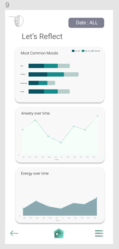
Reflect
All of the data from the inputs is summarized in a user-friendly format that makes it easy to draw insights. The date range for summaries can be adjusted and it shows the appropriate information about the most frequent moods (currently displays 4 by default but can be adjusted). It also shows the anxiety and energy levels over time.
This reflection piece is incredibly important to the design and use of the app as the user needs to be able to read and understand their data quickly. I kept the design of the charts minimal and sleek, focusing on the three key areas (mood, energy, anxiety).
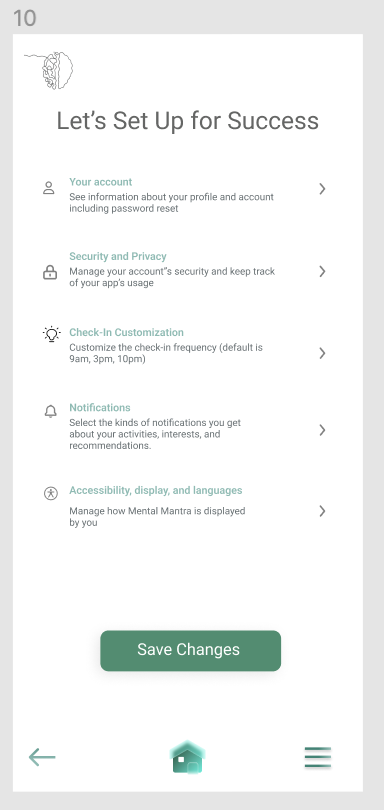
Set
This screen is where users can customize their app experience. Specifically, they can change the frequency of the check-ins or the check-in times. The default times are 9am, 3pm and 10pm. This can be adjusted to allow for times that match their lifestyle and app usage.
In addition, there are notification settings that can be turned on/off as well as information about accessibility and privacy. All changed settings can then be saved and is applied to future app usage.
Additional Iterations
After the four phases of the double diamond process, the framework repeats itself and continues to define, develop and deliver to validate the design, tweak the design or create completely new hypothesis that go through the phases again. Some of which would include the features I previously deprioritized.
In terms of the framework, The Double Design method helped in this use case to bring structure to an ambiguous design question. As this was an in-depth use of figma for higher fidelity designs (which was something new to me!), I wanted to also include some tips that were helpful to me along the way.
Figma Tips
Figma is easier than you think to use and it’s free!
This design tool may seem intimidating at first, but it’s relatively simple to use. It follows a lot of the same structure as photoshop and the easiest way to start is to just duplicate someone else’s screens and start playing around with it (and it’s free!)
The Figma community designs are an amazing resource!
You can search the libraries for the type of content you need (e.g. icons) or types of design (e.g. therapy apps) or even custom coding solutions for interactive figma aspects! There are so many figma design elements that you can draw inspiration from that are high quality and professional designs that you can easily copy-paste over to your designs.
Don’t be afraid to create your own designs.
While the community pages and screens are fantastic, sometimes it takes longer to copy and modify the design element than to create your own (e.g. rounded buttons).
Focus on a small number of high-value screens.
While the screens I designed don’t contain every iteration (e.g. if a user signs up for an account, creating the username, password and validating the email) I didn’t consider this a high-value design as it’s relatively simple and follows the same format as most typical screens. Focus your time and energy on screens that show your value prop and since this isn’t the final designs, focus on different screen navigations as opposed to flushing one out completely to get a better overall view of the design of the app
Only work on the “prototype” aspect of your designs once the screen designs are complete.
I went down a rabbit hole earlier on trying to include all the responsive elements of the screens as I could to make it “realistic”. While all these elements add an interactive element, I realized I needed to focus more on the actual design. While it would have been great to have a calendar date picker that let you select the actual date and was responsive to that, it doesn’t highlight the design itself and this doesn’t materially change the design.
I hope you enjoyed this article and my Figma designs, and that is was helpful to you. Feel free to reach out if you have any questions!